Almost there!
00
Project Header Image
Designing a city platform to reduce tourist friction

SmartHill

Role UX/UI Designer
Year 2025
Context XDi UX Design Course Project
Smarthill was a long-form UX project that ran throughout my UX design course at XDi, covering research, synthesis, information architecture, and ultimately the design of a city card purchase flow.

THE CHALLENGE AND SCOPE

Tourists struggle with fragmented city resources organized by administrative structure rather than visitor needs. Navigating disconnected websites and juggling multiple apps creates cognitive overload, leading to abandonment of official city services when tourists need them most

This project began with comprehensive UX research into the city tourism ecosystem, covering the full website including information architecture, homepage, and tourist sections. The scope was refined to deliver an MVP: the GoSmarthill Card purchase flow, a unified checkout that bundles transport, culture passes, and discounts into one seamless experience.

Single Image
Research
Insights

Research combined interviews with tourists (ages 25–35), competitor reviews, and journey mapping. Four findings directly shaped the GoSmarthill Card's structure and purchase flow.

Single Image
Single Image
01.
Users think in goals, not categories

Tourists think in interests like culture, food and outdoors, not departments or geography. Official city sites are trusted but avoided because they are built around how cities are run, not how people explore them

02.
Fragmented services kill confidence

Users think of transport, events and cultural access as one thing, but most city sites scatter them across separate pages

03.
Purchase decisions happen in the moment

Most tourists don't research city cards in advance. They decide while already planning or browsing. If the value wasn't clear in that moment, they left. The checkout flow had to communicate benefits immediately, with as few decisions as possible.

04.
Mobile is where it breaks

Users plan on desktop but navigate in city on mobile. Most city sites ignore this, causing drop offs at the worst possible time. A mobile first approach with short, step driven flows was non negotiable.

Design
Strategy

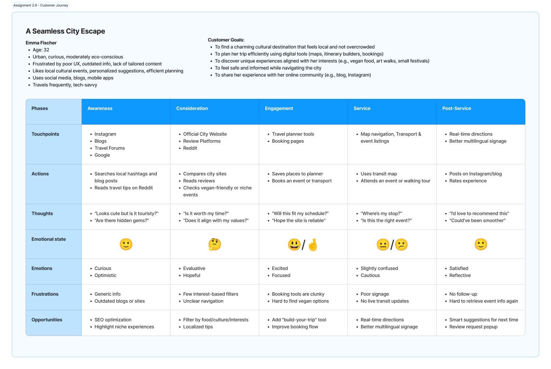
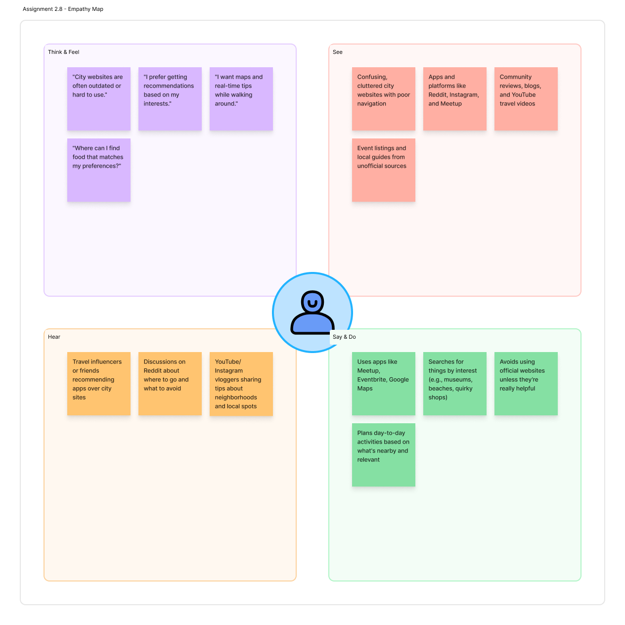
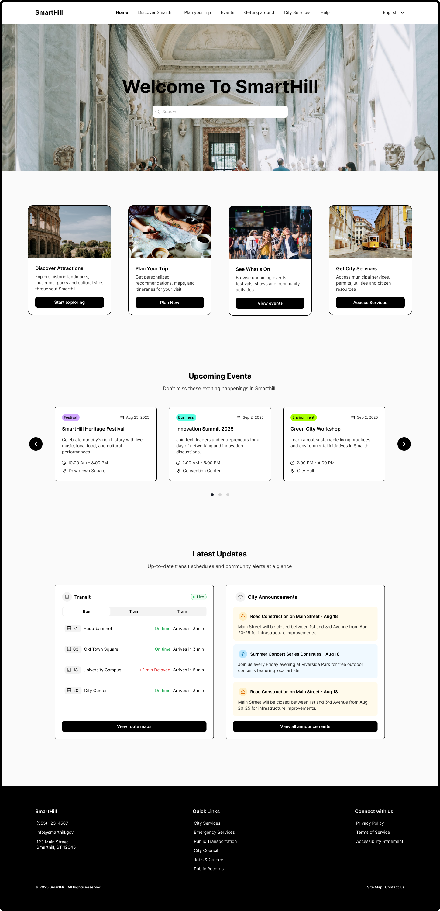
Research revealed a structural mismatch: official city platforms are organised around administrative departments, while tourists think in goals and immediate needs.
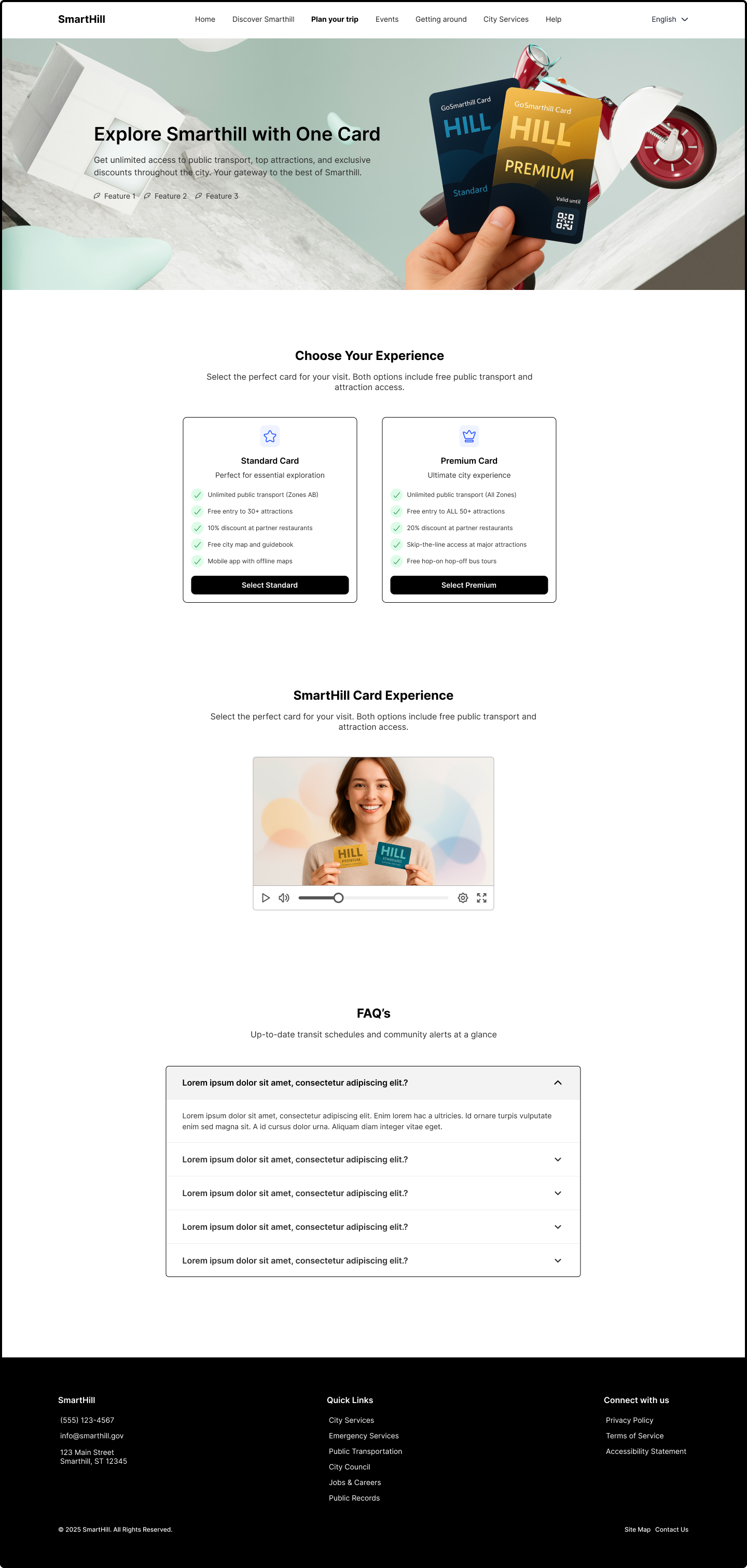
The strategy focused on correcting that mismatch, prioritising clarity, cohesion, and decision confidence over feature expansion. Information needed to be organised around what tourists want to do, not how the city manages itself. Cognitive load needed to be reduced at key decision points. Transport, cultural access, and discounts needed to feel like one system, not three separate things. And all of it needed to work primarily on mobile, in real time.
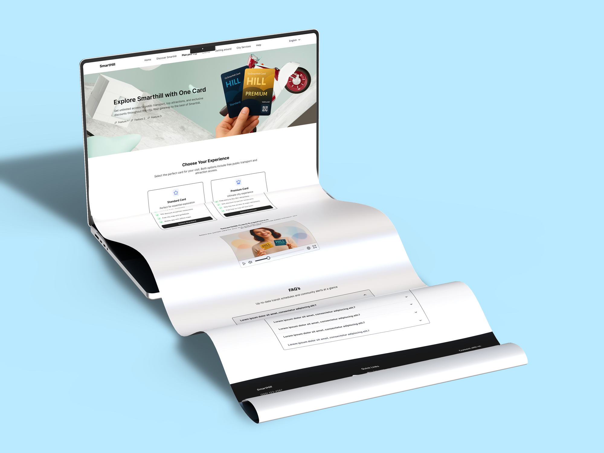
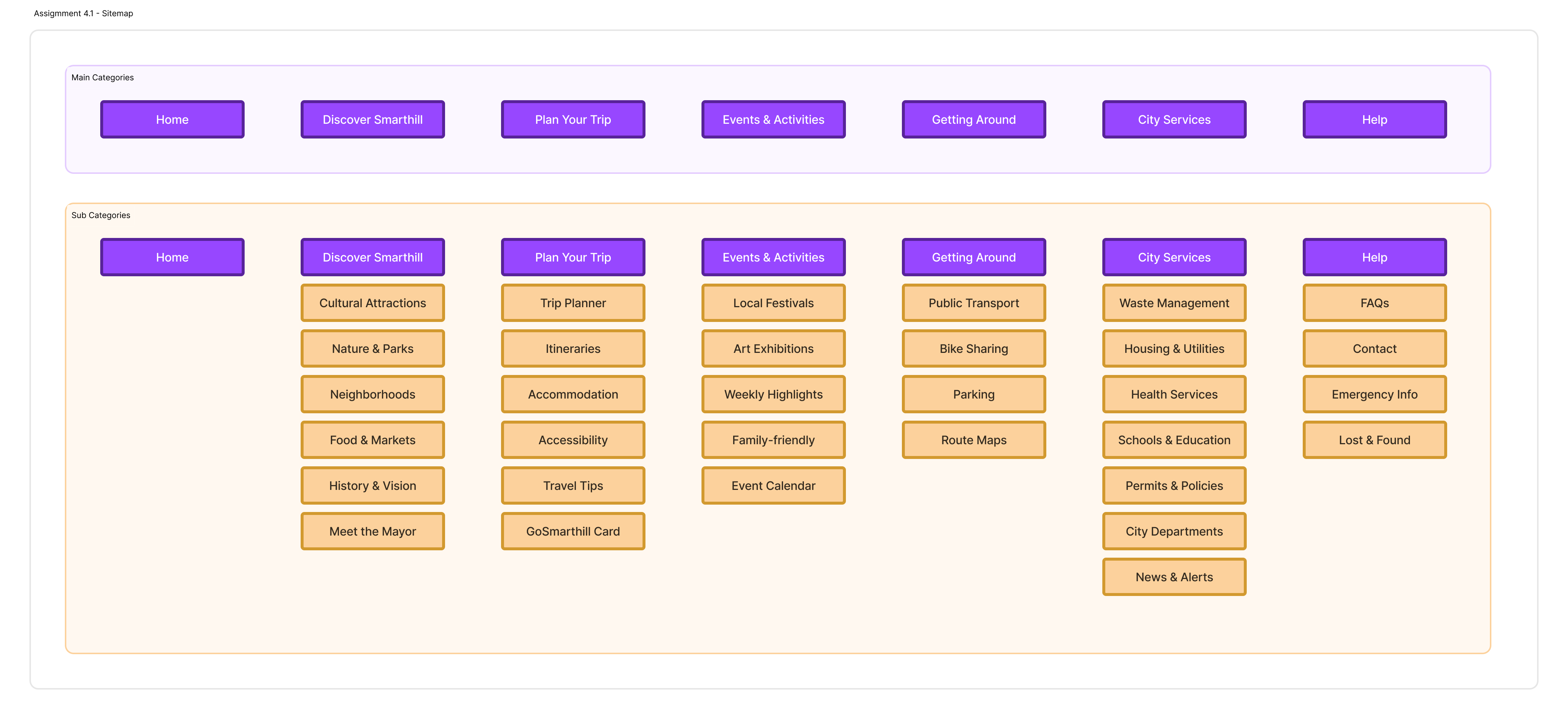
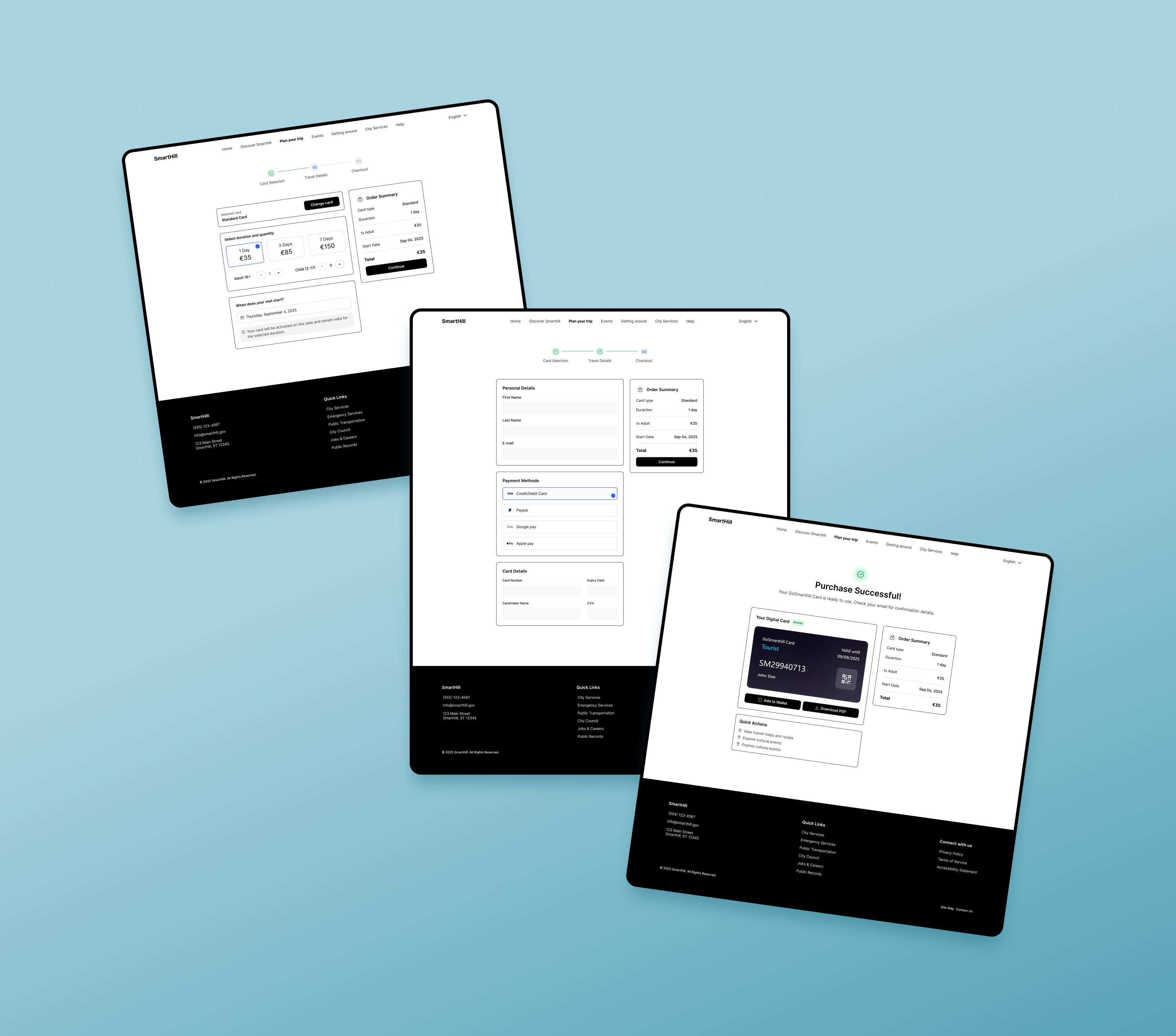
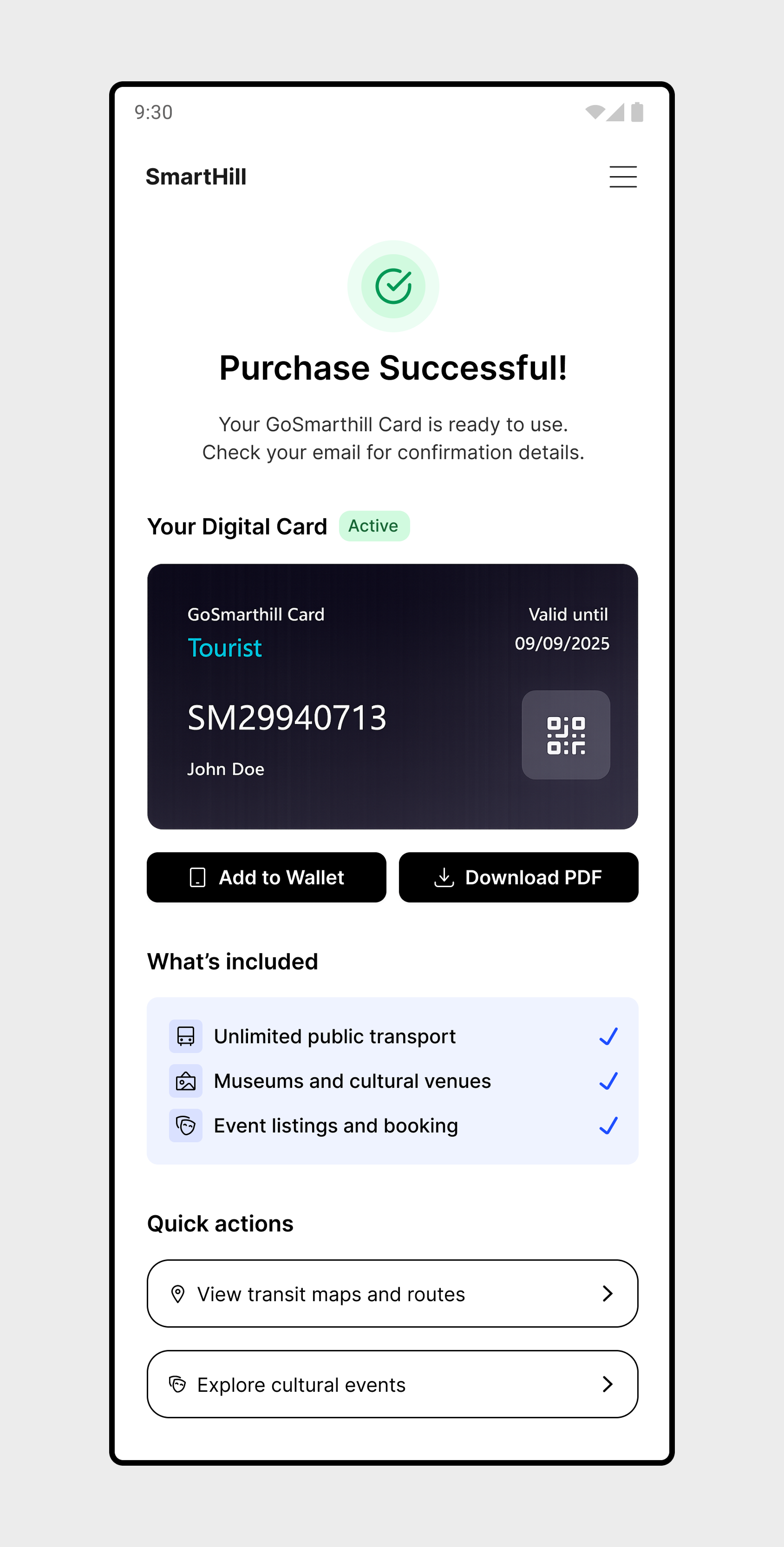
The sitemap below shows the final navigation structure, followed by the GoSmarthill Card purchase flowchart. Visual direction was defined to support these priorities, a neutral base with vibrant accents, keeping the interface clear without feeling cold.

Single Image
Single Image
Single Image
Solution
Walkthrough

The solution spans three connected parts: a homepage built around how tourists actually orient themselves, a city card page designed to communicate value and earn trust before the purchase begins, and a checkout flow that removes friction at the moment of decision. A video and FAQ section on the card page address doubts in real time. Throughout, the visual direction keeps things clean and focused.

Single Image
Single Image
Single Image
Single Image
Single Image
Single Image
Outcomes

This was a concept project, so there are no live metrics to report. But the design has a clear answer to each problem research identified, a homepage organised around visitor goals rather than city departments, a card page that communicates value before asking for commitment, a purchase flow that reduces decisions to the bare minimum, and a mobile-first approach throughout. If this were live, the key metrics would be checkout completion rate, time on the card page before purchase, and mobile drop-off across the three-step flow.

Reflection

The biggest gap in this project is the absence of usability testing. Decisions were rooted in research, but without testing they couldn't be properly validated. The purchase flow especially is something I'd want to put in front of real users to see how it actually pans out. The broader platform such as discovery, events, getting around etc were intentionally scoped out of the MVP, and each of those areas would need its own round of research and design. That would be the natural next step if the concept were taken further.