Almost there!
00
Project Header Image
Building visual consistency across a global localization product suite

Phrase

Client Phrase
Timeline 2021-2023
Role UI / Visual Designer
Phrase is a SaaS platform that automates and streamlines the translation and localization of digital products for global markets.

100+
Icons and illustrations created

4500
Users impacted

95%
Designer adoption

8
Products unified

PROJECT OVERVIEW AND ROLE

Phrase, a leading localization platform, merged with Memsource, a translation management system, to create a unified product suite. The project aimed to enhance visual consistency and user experience across all products, guided by 'Syntax' the internal design system.

My role focused on unifying UI visuals across the product suite by contributing to the Syntax design system, creating a comprehensive icon and illustration library, and refining key UI surfaces to improve consistency and usability.

Single Image
The
Challenge

Following the Phrase–Memsource merger, the design team was managing two separate visual languages across products. Designers spent 60% of their time recreating similar assets, while users experienced jarring visual inconsistencies when switching between products.
The image below shows the two primary editor UIs: TMS and Strings.

Single Image
Single Image
Design
Approach

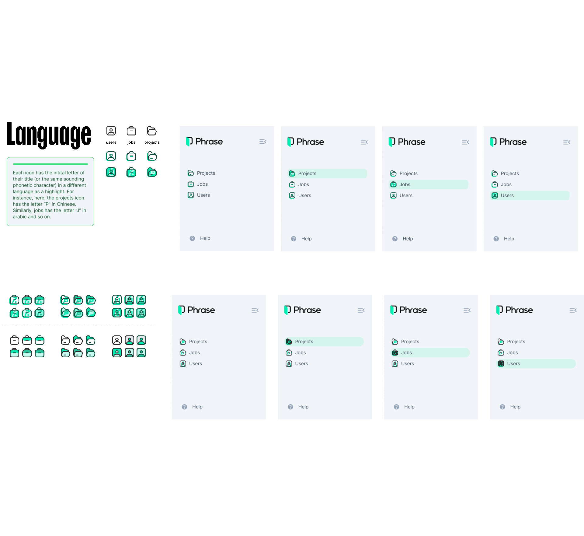
To assess visual fragmentation, I audited the product suite and reviewed icons, illustrations, and UI patterns. Discussions with designers and product managers revealed repeated asset rework, inconsistent cross-product experiences, and slower onboarding due to missing shared documentation.

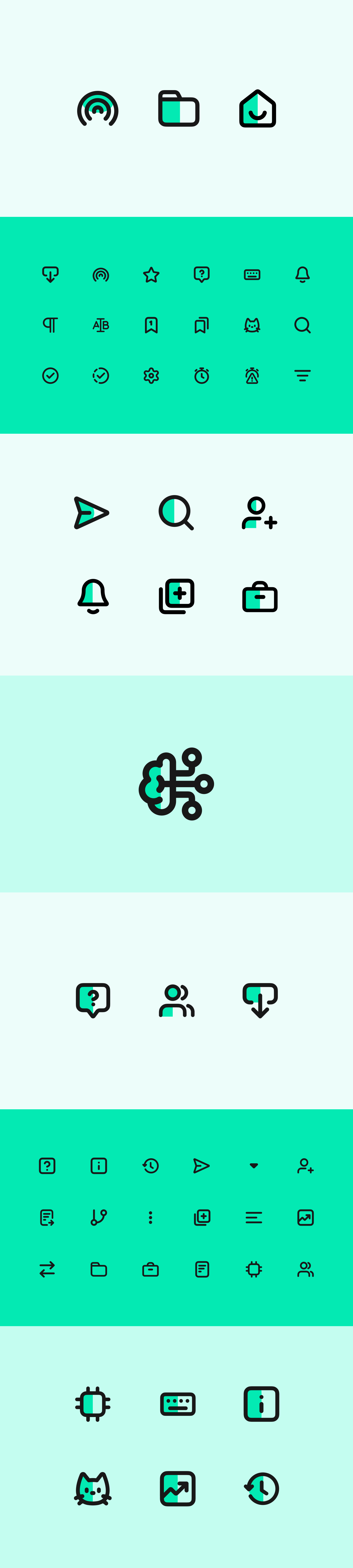
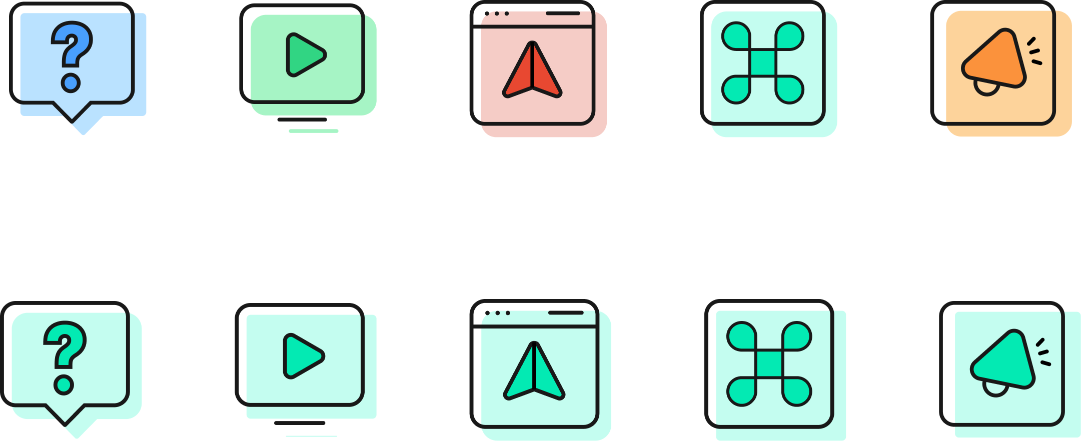
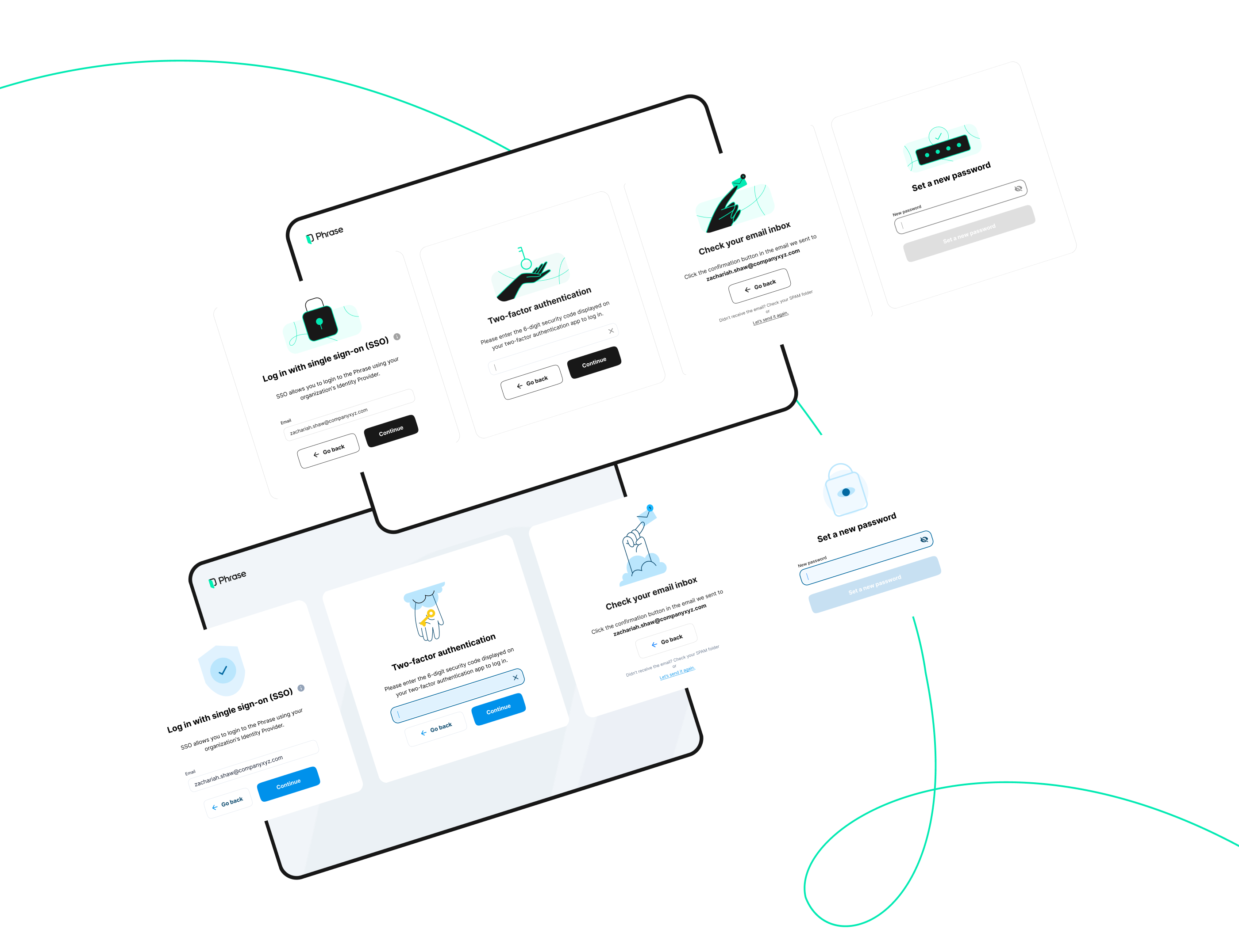
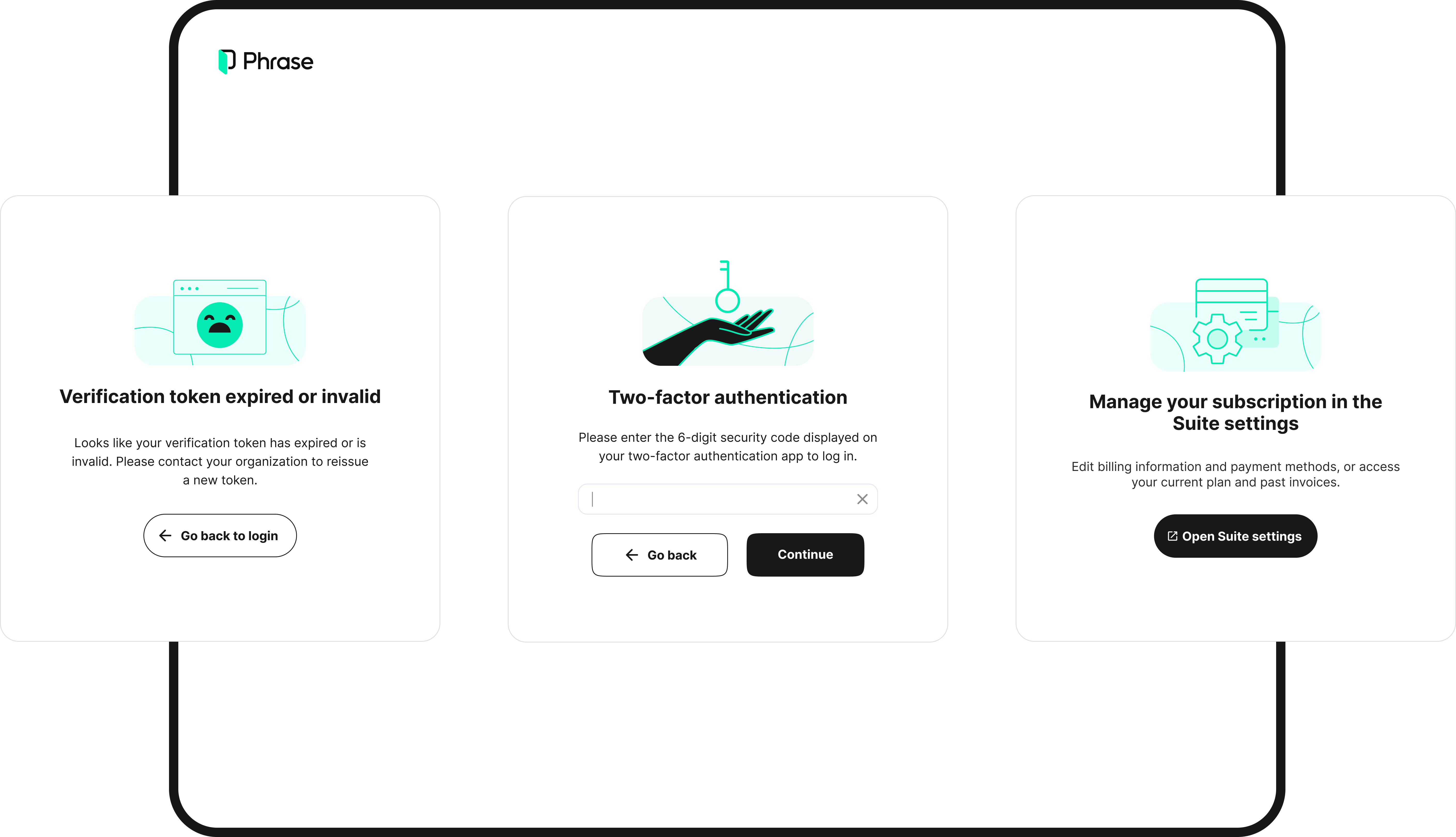
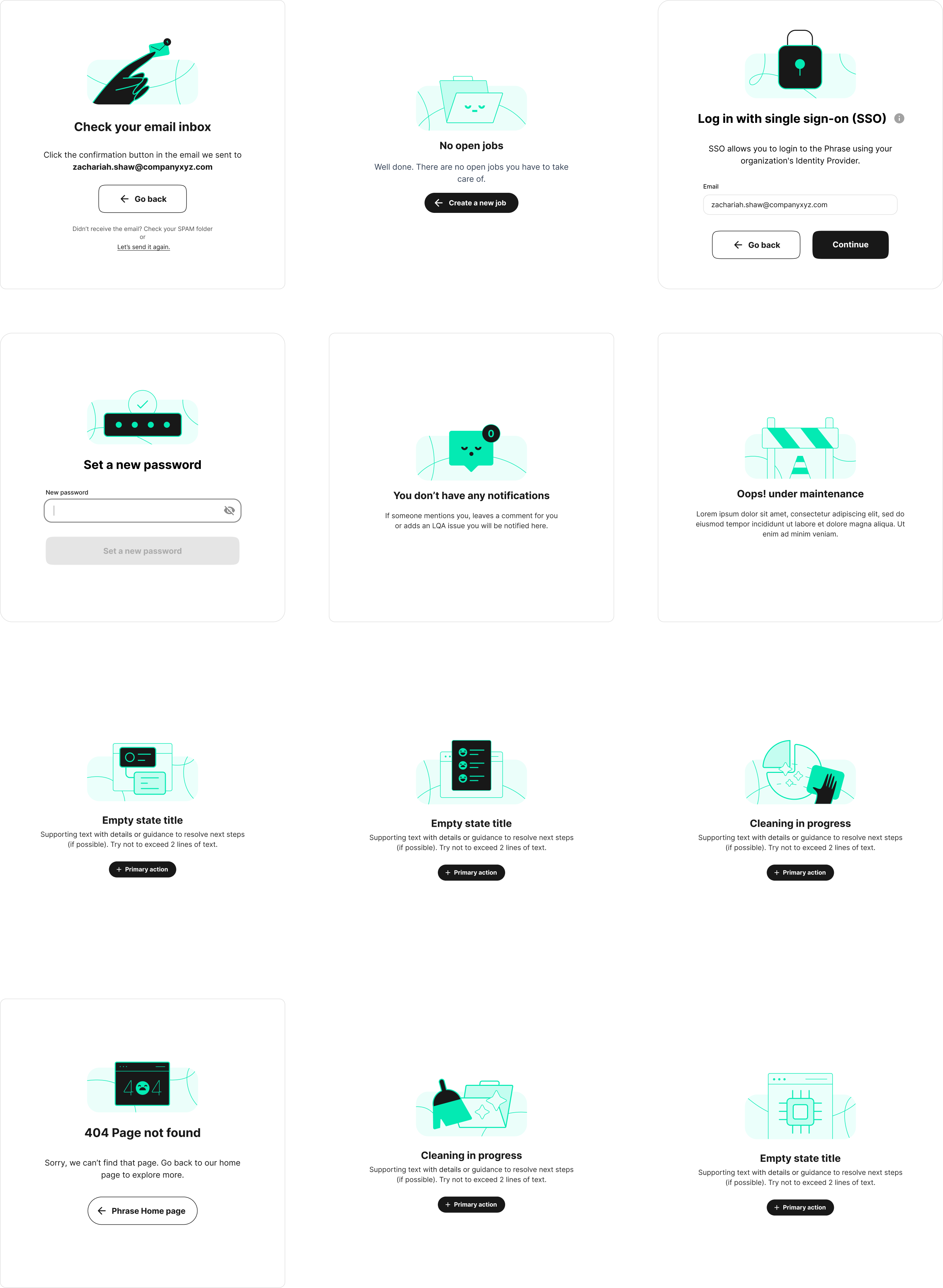
The audit showed that while Material Design icons were used as a base, they failed to cover specialized localization and editor workflows. There was no illustration system, no empty states, and no centralized asset library, forcing designers to solve the same problems independently.

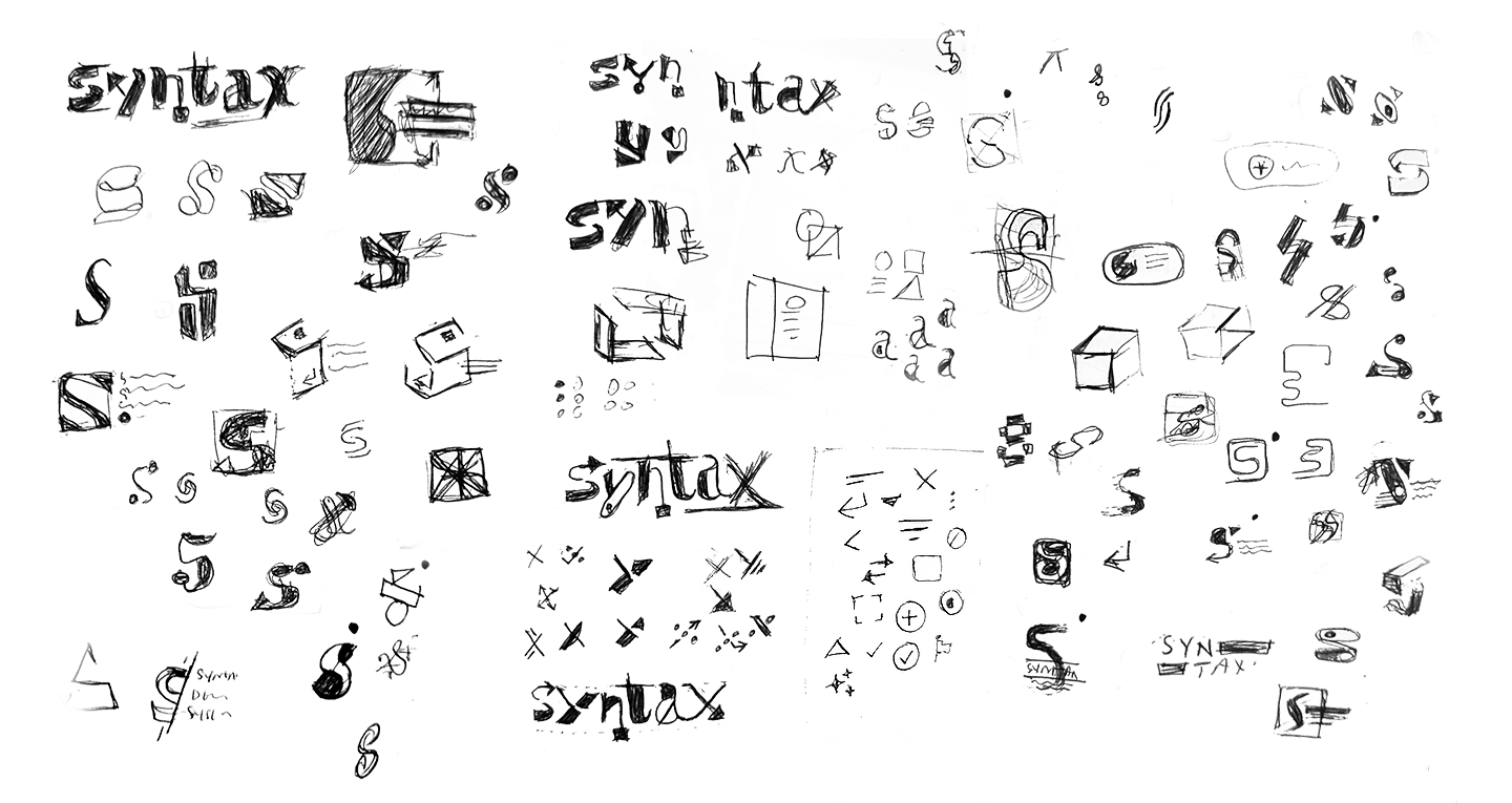
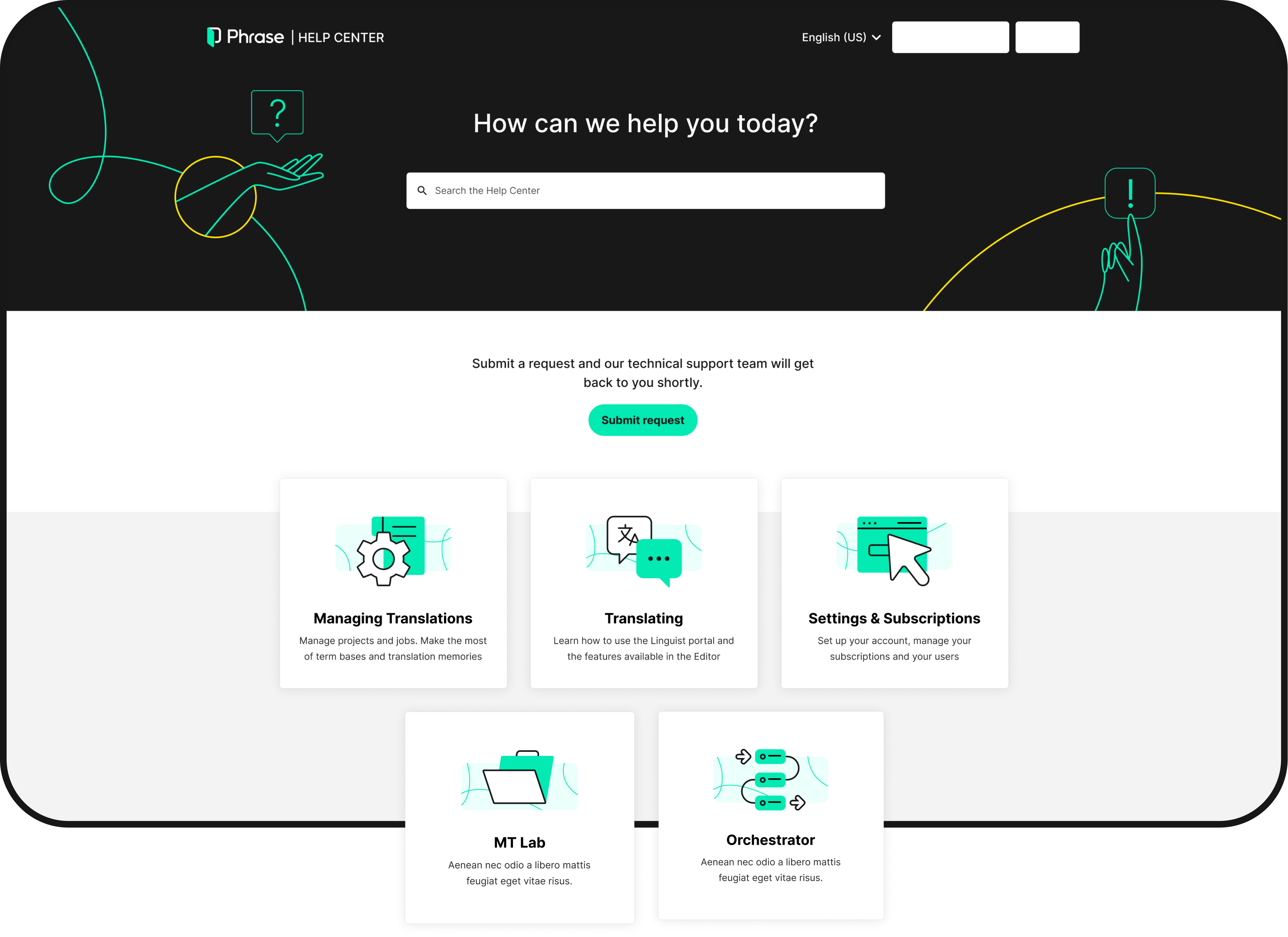
My solution focused on filling these gaps by creating three foundational systems: a custom icon library, a scalable illustration system for empty states and help content, and clear documentation to ensure consistency across the product suite.

Syntax
Design System

I designed the logo for Phrase’s internal design system, Syntax, to give the system a recognizable identity. The logo draws from the same modular principles used across the design system, reinforcing consistency between the system’s assets and its visual language.

Single Image
Single Image
Single Image
Overview
Icon Library

Material Design icons covered core needs, but they lacked support for specialized workflows such as localization, translation editors, and terminology management . I explored different approaches to create custom icons that would feel cohesive with Material Design while clearly representing these specialized functions. The challenge was balancing familiarity with the uniqueness our tools required.

Iconography
Exploration

Building new icons was just the start. I needed a system that other designers could use and extend. Through iterative feedback sessions with the team, I refined the icon style and documented comprehensive guidelines, defining when to rely on Material Design versus custom icons, along with technical specifications and naming conventions.

Single Image
Final Results
Single Image

HELP CENTER ICONS

These icons were created for Phrase's Help Center navigation. Since the overall structure was fairly rigid due to Zendesk's constraints, I had more creative freedom with these, making them friendlier and more approachable. The sections included help articles, tutorial videos, onboarding, keyboard shortcuts, and updates.

Single Image
Illustration
Library

I developed a modular illustration library to unify the visual experience across our product suite. Extending the rebrand's visual language, I created a flexible system that enabled teams to integrate illustrations into modals, empty states, alerts, and help content, ensuring consistency and clarity throughout the product.

Single Image
Single Image
Single Image
Single Image

HELP CENTER VISUALS

I developed a visual system for Phrase's Help Center to make complex localization workflows easier to understand within Zendesk's constraints. By introducing custom illustrations, section-level visuals, and reusable templates, I made dense documentation more scannable and approachable. This helped users find answers faster and reduced support ticket volume.

Single Image
Phrase
Rebrand UI

With the Syntax foundations in place, I worked closely with product designers to apply the new visual language across product surfaces. Using the rebrand's palette alongside the new icon and illustration systems, I created high-fidelity UI that aligned the product experience with Phrase's updated brand.

Single Image
CAT editor
Loading animation

I designed a playful loading animation for Phrase's CAT (Computer-Aided Translation) editor to add personality to a task-heavy workflow. By turning unavoidable wait times into moments of delight, the animation reinforced Phrase's friendly brand and earned direct user praise.

Single Image
Single Image

FINAL IMPACT

This project established the foundation for long-term brand cohesion and design scalability across Phrase's unified product suite. Syntax reduced designer asset creation time by 60%, achieved 95% adoption across the product team, and unified 8 products with 100+ custom icons and illustrations, creating visual consistency for 4,500+ users

The centralized library streamlined workflows and enabled faster design cycles, while the unified visual language reduced cognitive load for users switching between products. For the business, Syntax accelerated product development, strengthened brand recognition post-merger, and created a scalable foundation for future growth without proportional team expansion.